A Simple Linear Regression of Wine Prices to Scores
Posted on October 20, 2018 in Wine-Ratings
In the previous post, I looked at the distributions of wine scores and prices. Next, I wanted to look at the relationship between a wine's price and its score. After all, a customer wants to know that as they pay more money for a bottle of wine, they are receiving a better product
def logfunc(x, a, b, c):
    return a * np.log(b*x) + c


xnew = np.linspace(2, df['price'].max(), 2000)
popt, pcov = curve_fit(logfunc, df['price'], df['score'])
plt.close('all')
plt.figure(figsize=(12,8))
plt.plot(xnew, logfunc(xnew, *popt), 'r-', label='fit: a=%5.3f, b=%5.3f, c=%5.3f' % tuple(popt))
plt.scatter(df['price'], df['score'], color='b', marker = ".", s=15, label="Review")
plt.xlabel("Price")
plt.ylabel("Score")
plt.title("Price to Score")
plt.legend()
plt.show()

predictedScore = list()
for price in df['price']:
    predictedScore.append(logfunc(price, *popt))


print('R-Squared: ',r2_score(df['score'], predictedScore))
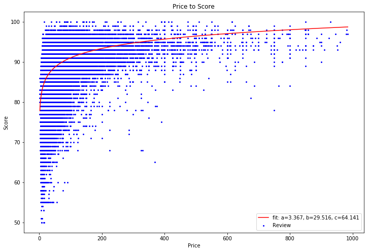
R-Squared: 0.314735682258
Because there are many different ratings for the same price range, the regression only has a R-Squared value of .314. Next I took a look at fitting the linear regression to the average score of each price range in an attempt to reduce the "noise" in the reviews
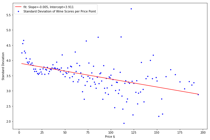
To avoid the effects of outliers, I only used included an average rating data point if there were 20 or more data points for the particular price point. In addition, I chose the maximum wine price to look at to be 200$. In the cumulative distribution function shown in the previous post, 99% of wines were 200 dollars or less.
A look at the results shows that the regression accurately models the average price for each wine with an R-Squared of .96. The regression also demonstrates the wine score to wine price relationship follwos the law of diminishing marginal returns - for each additional dollar spent on your bottle of wine, the quality of the wine will improve less and less.
priceOfWineList = list()
averageScorePerPrice = list()
stdDevPerPrice = list()
priceOfWineLessThan25 = list()
stdDevPerPriceLessThan25 = list()
priceOfWineGreaterThan25 = list()
stdDevPerPriceGreaterThan25 = list()
for x in range(df['price'].min(), 200):
criteria = df['price'] == x
if df[criteria].shape[0] > 20: #Only add this to the list of data in the regression if there are more than 20 data points per price
priceOfWineList.append(x)
averageScorePerPrice.append(df[criteria]['score'].mean())
stdDevPerPrice.append(df[criteria]['score'].std())
if x <= 25:
priceOfWineLessThan25.append(x)
stdDevPerPriceLessThan25.append(df[criteria]['score'].std())
else:
priceOfWineGreaterThan25.append(x)
stdDevPerPriceGreaterThan25.append(df[criteria]['score'].std())
xnew = np.linspace(2, 200, 200)
popt, pcov = curve_fit(logfunc, priceOfWineList, averageScorePerPrice)
plt.close('all')
plt.figure(figsize=(12,8))
plt.plot(xnew, logfunc(xnew, *popt), 'r-', label='fit: a=%5.3f, b=%5.3f, c=%5.3f' % tuple(popt))
plt.scatter(priceOfWineList, averageScorePerPrice, color='b', marker = ".", s=15, label="Average Score of Wines for this price")
plt.xlabel("Price")
plt.ylabel("Score")
plt.title("Price to Average Score")
plt.legend()
plt.show()
predictedScore = list()
for price in priceOfWineList:
predictedScore.append(logfunc(price, *popt))
print('R-Squared: ', r2_score(averageScorePerPrice, predictedScore))

R-Squared: 0.962570480361
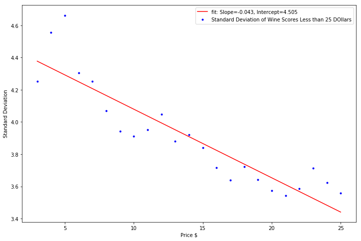
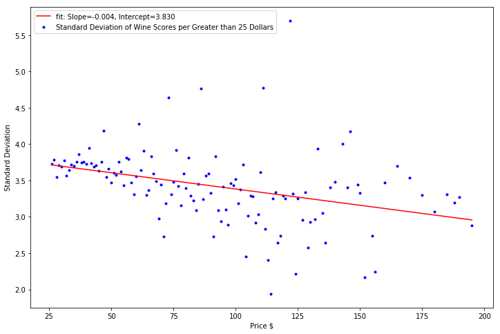
Finally, I took a look at the standard deviation of the wines at each price. The correlation of increasing wine prices to decreasing wine score standard deviation was the strongest in wine prices less than 25 dollars. Afterwards, the decrese in the wine score standard deviation was minimal as wine price increased.
Perhaps unsuprisingly, this means that the standard deviation of the wine scores dropped as the wines got more and more expensive. The effect was most pronounced among wines less than 25 dollars where a lot of variation in the quality of the wine exists. You might pick up a fantastic bottle (at a fantastic value) or you might pick up an absolutely awful bottle of wine. After the 25 dollar price point, the quality of the bottle has improved, and the chance that the bottle is much better or worse than the mean decreases
```python
slope, intercept, r_value, p_value, std_err = stats.linregress(priceOfWineList, stdDevPerPrice)
plt.close('all')
plt.figure(figsize=(12,8))
plt.scatter(priceOfWineList, stdDevPerPrice, color='b', marker = ".", label="Standard Deviation of Wine Scores per Price Point")
plt.plot(priceOfWineList, intercept + slope*np.array(priceOfWineList), 'r', label = 'fit: Slope=%5.3f, Intercept=%5.3f' % (slope, intercept))
plt.xlabel('Price $')
plt.ylabel('Standard Deviation')
plt.legend()
plt.show()
print("R-Squared:", r_value**2)
R-Squared: 0.232431799395
slope, intercept, r_value, p_value, std_err = stats.linregress(priceOfWineLessThan25, stdDevPerPriceLessThan25)

plt.close('all')
plt.figure(figsize=(12,8))
plt.scatter(priceOfWineLessThan25, stdDevPerPriceLessThan25, color='b', marker = ".", label="Standard Deviation of Wine Scores Less than 25 DOllars")
plt.plot(priceOfWineLessThan25, intercept + slope*np.array(priceOfWineLessThan25), 'r', label = 'fit: Slope=%5.3f, Intercept=%5.3f' % (slope, intercept))
plt.xlabel('Price $')
plt.ylabel('Standard Deviation')
plt.legend()
plt.show()

print("R-Squared:", r_value**2)
R-Squared: 0.818877157969
slope, intercept, r_value, p_value, std_err = stats.linregress(priceOfWineGreaterThan25, stdDevPerPriceGreaterThan25)

plt.close('all')
plt.figure(figsize=(12,8))
plt.scatter(priceOfWineGreaterThan25, stdDevPerPriceGreaterThan25, color='b', marker = ".", label="Standard Deviation of Wine Scores per Greater than 25 Dollars")
plt.plot(priceOfWineGreaterThan25, intercept + slope*np.array(priceOfWineGreaterThan25), 'r', label='fit: Slope=%5.3f, Intercept=%5.3f' % (slope, intercept))
plt.xlabel('Price $')
plt.ylabel('Standard Deviation')
plt.legend()
plt.show()

print("R-Squared:", r_value**2)
R-Squared: 0.134744325421
So given all the plots above, what's the recommendation on which wine to purchase?
For me, if I'm trying to purchase something safe, say for a dinner party, I would pick something around the 25 dollar range. Given the simplified regression model above, these wines will on average fall into Wine Spectator's "85-89 Very good: a wine with special qualities" range. In addition, the variance of these wines has diminished as well, so odds are that you'll get a wine near the average.
If I was trying to find a "steal", I would focus around the 10 to 15 dollar range. These wines are in the Good to Very Good ranges in Wine Spectator's rating system and because of the higher standard deviation in this price range, one can find better value