A First Look at Wine Scores and Prices
Posted on September 07, 2018 in Wine-Ratings
Wine Spectator magazine, one of the largest wine scoring operations indicates the following qualitative rating by score:
- 95-100 Classic: a great wine
- 90-94 Outstanding: a wine of superior character and style
- 85-89 Very good: a wine with special qualities
- 80-84 Good: a solid, well-made wine
- 75-79 Mediocre: a drinkable wine that may have minor flaws
- 50-74 Not recommended
Given the rating scale above, I was curious as to how many wines fall into each of the above categories? What percentage of wines are a considered a Classic? And what percentage are Not Recommended?
Looking at a histogram of wine reviews, which are collected from over the past 20 years, I found that the distribution the majority of wines were rated as "Very Good"
numReviews = df.dropna().shape[0]
percentRatings = list()
ratingCategories = ["Not Recommended", "Mediocre", "Good", "Very Good", "Outstanding", "Classic"]
percentRatings.append(df[(df['score'] < 75)].dropna().shape[0] / numReviews)
percentRatings.append(df[(df['score'] >= 75) & (df['score'] < 80)].dropna().shape[0] / numReviews * 100)
percentRatings.append(df[(df['score'] >= 80) & (df['score'] < 85)].dropna().shape[0] / numReviews * 100)
percentRatings.append(df[(df['score'] >= 85) & (df['score'] < 90)].dropna().shape[0] / numReviews * 100)
percentRatings.append(df[(df['score'] >= 90) & (df['score'] < 95)].dropna().shape[0] / numReviews * 100)
percentRatings.append(df[(df['score'] >= 95) & (df['score'] <= 100)].dropna().shape[0] / numReviews * 100)

y_pos = np.arange(len(percentRatings))
fig = plt.figure(figsize=(12,8))
plt.bar(y_pos, percentRatings)
plt.xticks(y_pos, ratingCategories, rotation='vertical')
plt.title('Percent of Wines per Rating Scale')
plt.xlabel('Rating Scale')
plt.ylabel('Percent of Wines')
plt.show()
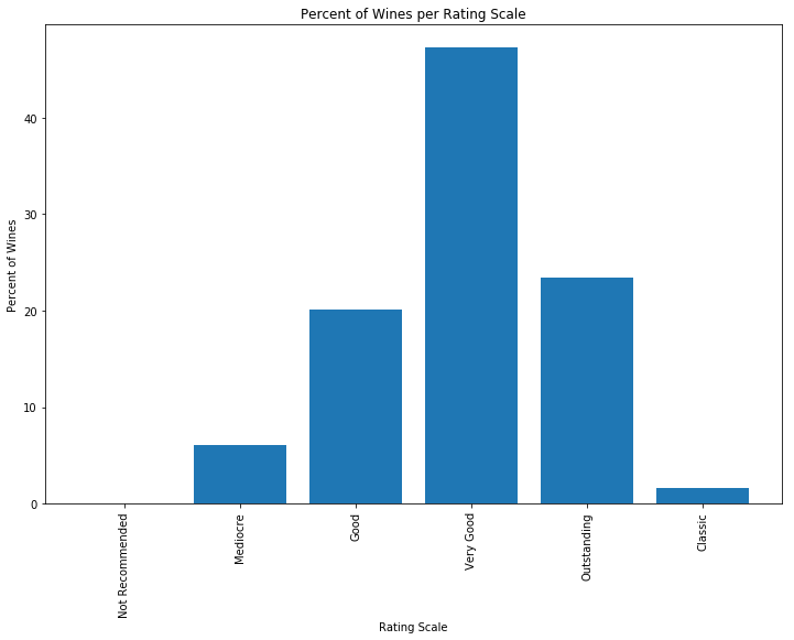
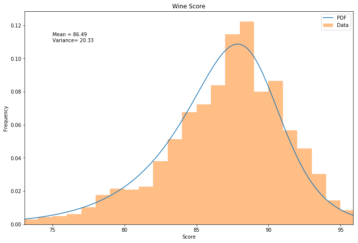
The data shows that about half of the wines are considered "Very Good". I then plotted the histogram and then attempted to fit various distributions in Scipy Stats using the sample code from this stackoverflow comment: https://stackoverflow.com/a/37616966. After running through the various distribution types offered by scipy, the Burr Type3 Distribution was found to be the best fit to the wine scores.
scale_dataframe = pd.DataFrame(
    {
        "Rating" : ratingCategories,
        "% of Wines" : percentRatings
    }
)

scale_dataframe = scale_dataframe[['Rating', '% of Wines']]
scale_dataframe
| Rating | % of Wines | |
|---|---|---|
| 0 | Not Recommended | 0.016254 |
| 1 | Mediocre | 6.049078 |
| 2 | Good | 20.061396 |
| 3 | Very Good | 47.284385 |
| 4 | Outstanding | 23.369795 |
| 5 | Classic | 1.609901 |
# Code used from: https://stackoverflow.com/a/37616966 to identify the best fit distribution
def make_pdf(dist, params, size=10000):
    # Separate parts of parameters
    arg = params[:-2]
    loc = params[-2]
    scale = params[-1]

    # Get sane start and end points of distribution
    start = dist.ppf(0.01, *arg, loc=loc, scale=scale) if arg else dist.ppf(0.01, loc=loc, scale=scale)
    end = dist.ppf(0.99, *arg, loc=loc, scale=scale) if arg else dist.ppf(0.99, loc=loc, scale=scale)

    # Build PDF and turn into pandas Series
    x = np.linspace(start, end, size)
    y = dist.pdf(x, loc=loc, scale=scale, *arg)
    pdf = pd.Series(y, x)

    return pdf

plt.close('all')
# Plot for comparison
plt.figure(figsize=(12,8))
ax = df['score'].plot(kind='hist', bins=50, normed=True, alpha=0.5, color=list(matplotlib.rcParams['axes.prop_cycle'])[1]['color'])
# Save plot limits
dataYLim = ax.get_ylim()
plt.close('all')
# Find best fit distribution (Note that this was run offline) was a burr distribution
best_dist = stats.burr
c = 53.64
d = 0.43
loc = -0.62
scale = 89.99
best_fit_params = [c, d, loc, scale]

# Update plots
ax.set_ylim(dataYLim)
ax.set_xlabel('Score')
ax.set_ylabel('Frequency')

# Make PDF with best params
pdf = make_pdf(best_dist, best_fit_params)
# Display
plt.figure(figsize=(12,8))
ax = pdf.plot(label='PDF', legend=True)
df['score'].plot(kind='hist', bins=50, normed=True, alpha=0.5, label='Data', legend=True, ax=ax)

ax.set_title('Wine Score')
ax.set_xlabel('Score')
ax.set_ylabel('Frequency')
plt.text(75, .11, "Mean = " + str(round(np.mean(df['score']),2)) + "\nVariance= " + str(round(np.var(df['score']),2)))
plt.show()
[mean, variance] = stats.burr.stats(c, d, loc, scale, moments='mv')
print('Burr Distribution Mean: ', mean)
print('Burr Distribution Variance: ', variance)
Burr Distribution Mean:  86.55339899035235
Burr Distribution Variance:  20.21289883256894
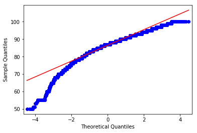
Finally, I then ran a QQ plot on the Wine Ratings to see whether the data was approxmiately normal. From the QQ plot, the data appears to be skewed to the left.
qqplot(df['score'], line='s')
plt.show()
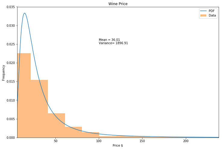
Using the same stack overflow code from above, the inverted weibull distribution, also known as the Frechet distribution, was determined to be the best fit.
plt.close('all')
# Plot for comparison
plt.figure(figsize=(12,8))
ax = df['price'].plot(kind='hist', bins=50, normed=True, alpha=0.5, color=list(matplotlib.rcParams['axes.prop_cycle'])[1]['color'])
# Save plot limits
dataYLim = ax.get_ylim()
plt.close('all')
# Find best fit distribution (Note that this was run offline) was a burr distribution
best_dist = stats.invweibull
c = 2.01
loc = -5.71
scale = 24.72
best_fit_params = [c, loc, scale]

# Update plots
ax.set_ylim(dataYLim)
ax.set_xlabel('Price $')
ax.set_ylabel('Frequency')

# Make PDF with best params
pdf = make_pdf(best_dist, best_fit_params)
# Display
plt.figure(figsize=(12,8))
ax = pdf.plot(label='PDF', legend=True)
df['price'].plot(kind='hist', bins=50, normed=True, alpha=0.5, label='Data', legend=True, ax=ax)

ax.set_title('Wine Price')
ax.set_xlabel('Price $')
ax.set_ylabel('Frequency')
plt.text(100, .025, "Mean = " + str(round(np.mean(df['price']),2)) + "\nVariance= " + str(round(np.var(df['price']),2)))
plt.show()
[mean, variance] = stats.invweibull.stats(c, loc, scale, moments='mv')
print('Inverse Weibull Distribution Mean: ', mean)
print('Inverse Weibull Variance: ', variance)
Inverse Weibull Distribution Mean:  37.892236608071414
Inverse Weibull Variance:  120575.87260458428
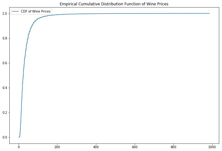
In looking at the price of the wines reviewed, we find that the cheapest wine reviewed was 2 dollars and then most expensive was 985 dollars! However, looking at the CDF of the wine prices, 99% of the wines reviewed are less than 200 dollars.
print('Minimum price of wine reviewed:' ,df['price'].min())
print('Maximum price of wine reviewed: ', df['price'].max())
Minimum price of wine reviewed: 2
Maximum price of wine reviewed:  985
#Cumulative Distribution for Prices
x = np.sort(df['price'])
y = np.arange(len(x))/float(len(x))
plt.figure(figsize=(12,8))
plt.plot(x, y, label='CDF of Wine Prices')
plt.title('Empirical Cumulative Distribution Function of Wine Prices')
plt.legend()
plt.show()